Community Transport Organisation
ARTWORK TITLE
BRIEF
Creating the artwork for CTO’s Reconciliation Action Plan. with an emphasis on : Our purpose and focus of the organisation is the ‘Community’ component of ‘Community Transport’ and our role in supporting, and driving benefit to the communities we operate within. We seek to enable connected and thriving communities. Community transport is about responding with care, to support and deliver a service that is individualised, informed, and holistic to the community, regardless of where an individual lives, culture, or ability to pay. It is this concept, being an enabler of mobility, of choice, of self-determination, that we would like to capture in the art work. Below is a bit of a brainstorm of the purpose/mission/values of the CTO which we would like to incorporate in the design:
– People are at the centre of everything we do
– Community facing
– Enabler of connected and thriving communities
– We create solutions to improve access and wellbeing in community
– Supporting individuals to live the life of their choosing
– Mobility, choice, self-determination
– Access for all
– Services across all areas of NSW, from Sydney to Broken Hill, from the sea, to hills, to desert. Every LGA across the state has a funded Community Transport provider
– Enabling SOCIAL CONNECTION
STORY
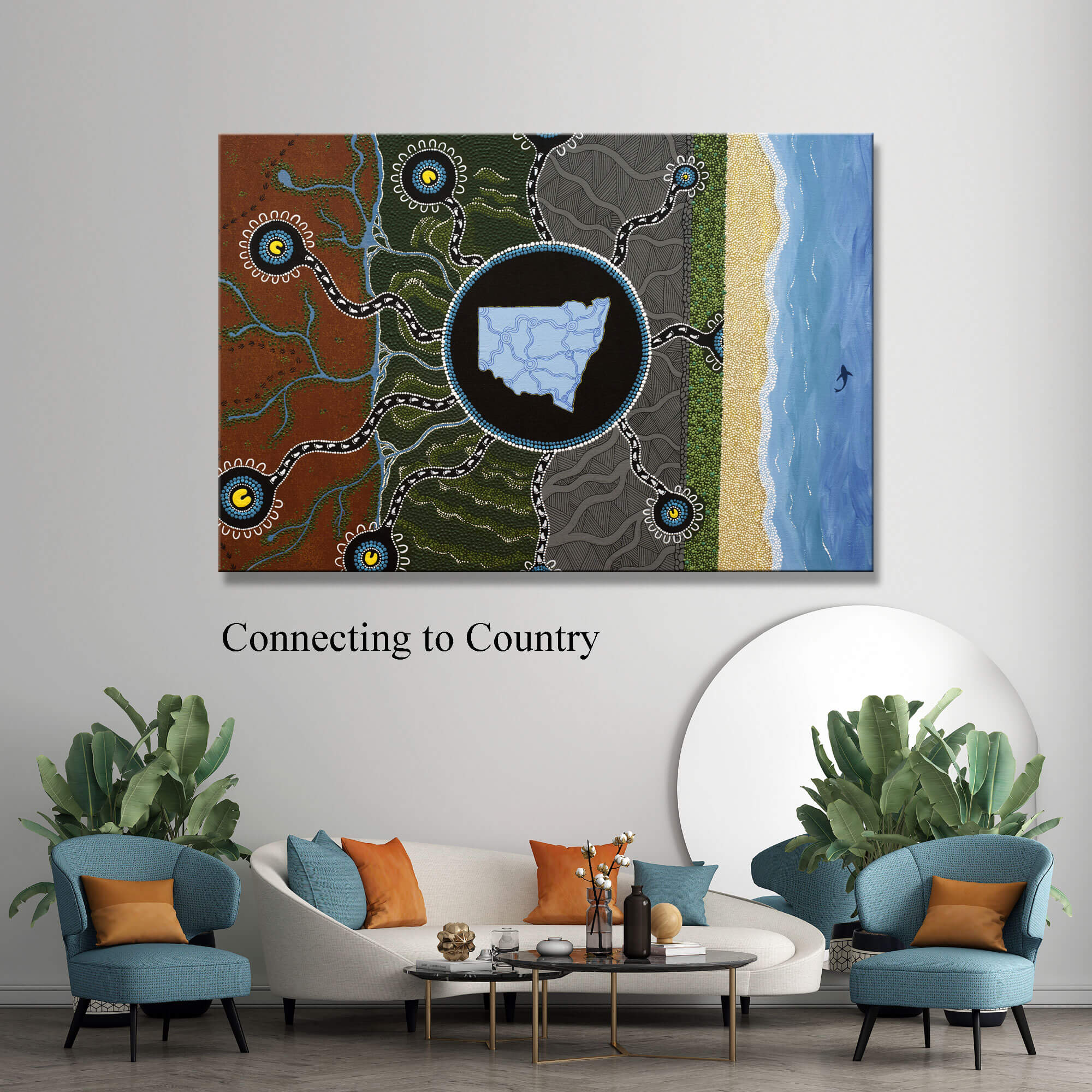
This artwork represents Community Transport Organisation’s focus on providing mobility services to the NSW Community.
There were 9 key elements to focus on, this is represented by the 9 journey lines and meeting places across the artwork.
1. People are at the centre of everything we do – This is represented at the centre of every one of the 9 meeting places, in yellow, The “U” shaped symbol, which is the Aboriginal symbol for people, each meeting place is then surrounded by many other people, this represents CTO’s team working with each individual person.
2. Community Facing – Meaning that community transport providers exist to meet the needs of the community they operate within. So they look outward to their community in the design of their services, and are informed by the needs of their community, therefore no two providers operate in the same way – This is represented by the centre of the artwork, a large meeting place with many journey lines facing outwards, going into the community, representing the diversity in services needed under different circumstances, and how CTO adapts to meet the needs of the community.
3. Enabler of Connected and Thriving Communities – The journey lines are helping to connect communities and allow people to connect to one another regardless of where they are located. This is also represented in the map of NSW in the middle of the artwork. All meeting places are interconnected by journey lines.
4. We create solutions to improve access and wellbeing to community – The whole artwork shows the shores of the east coast, through the grey section that represents urban community, and the green sections is the Great Dividing Range, then the red earth of the outback as far west of NSW, the journey lines that cross these differing terrains, represents the solutions that CTO comes up with, in order to serve all parts of the community.
5. Supporting individuals to live the life of their choosing – This is again represented by each meeting place being a part of different communities, this can also represent an individual’s life choices and the understanding of what they choose, they will always be supported.
6. Mobility Choice, self-determination – Again this is represented by the numerous journey lines.
7. Access for all – The artwork represents this by showing that the journey lines cover all aspects of NSW, regardless of where you live, or how you live, the CTO will support you.
8. Services across all areas of NSW, from Sydney to Broken Hill, from the sea to hills, to desert. Every LGA across the State has a funded Community Transport provider – This is the basis of the main part of the artwork. The colours running from left to right represent the red earth of far western NSW, the Mountains and hills of the Great Dividing Range, to seaside communities of the east coast.
9. Enabling Social Connection – This is again represented by the interconnecting journey lines in blue at the centre of the artwork and map of NSW, along with 9 main journey lines connecting all communities.


