Tennis NSW

ARTWORK TITLE

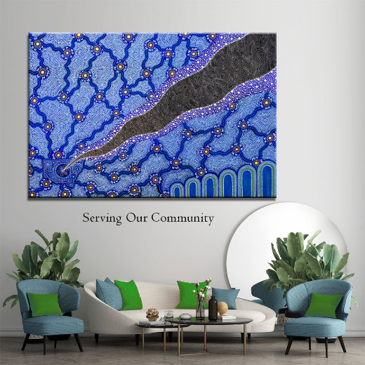
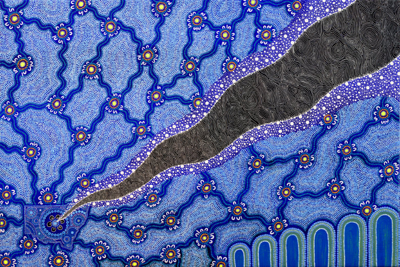
Serving our Community

BRIEF
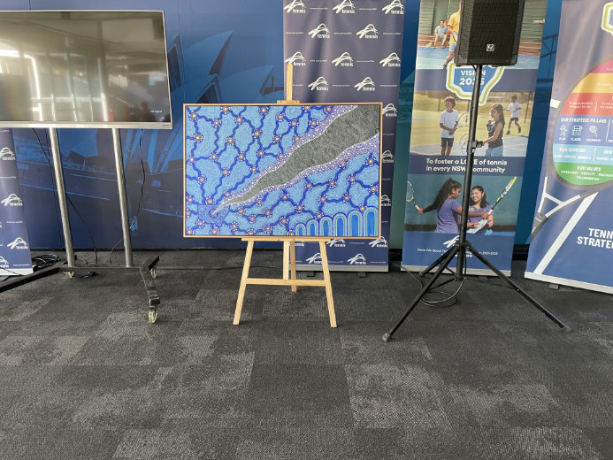
Create an artwork for Tennis NSW’s first Reconciliation Action plan.
STORY
Bottom left of the artwork shows a map of NSW, the Map represents Tennis NSW. Leading out from the center of the map is a black and white section, filled with intersecting line work, this is an abstract representation of a tennis net, weaving across the artwork from bottom left to top right, growing from a small area to reach right across the artwork, it represents the growth in tennis NSW’s reach into communities. The Black and white also represents bringing black and white Australians closer together and providing equal opportunity through the great sport of tennis. Either side of this lined area are hundreds of dots in various sizes, these represent a couple of things, they emulate stars, which I liken to reaching for the stars, meaning for players to go after their goals. It also represents opportunity, and that there are vast opportunities when you are willing to work hard.

The blue/green lines running out of NSW are journey lines and connecting pathways to communities. Each community is done in green to represent both a meeting place and also tennis balls. The coloured dots around these are to connect the colours of Tennis NSW. Outside of these meeting places is a series of white “U” shaped symbols, these represent the people in these communities coming into tennis and connecting through the sport. The journey lines also act like the roots of a tree expanding out to the community to promote nurturing and growth. Bottom right of the artwork will have a series of mountains, these represent both the Great Dividing range, but also as they will begin to grow from left to right, signifying the growth in participants in Tennis across NSW and how Tennis NSW is providing opportunities in all our communities.